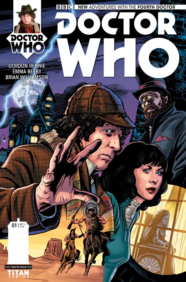
Doctor Who: The Fourth Doctor #1 – Cover C by Brian Williamson
Writers: Emma Beeby and Gordon Rennie
Artist: Brian Williamson
Colours: Hi-Fi
Letters: Richard Starkings and Comicraft’s Jimmy Betancourt
Designer: Rob Farmer
Main Covers: Alice X. Zhang, Will Brooks, Brian Williamson, Jay Gunn, Matt Baxter, Ben Oliver, Blair Shedd and Simon Myers
(A number of special covers have also been generated for different comic shops)
Publisher: Titan
Out: Now
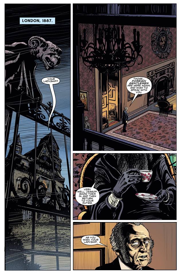
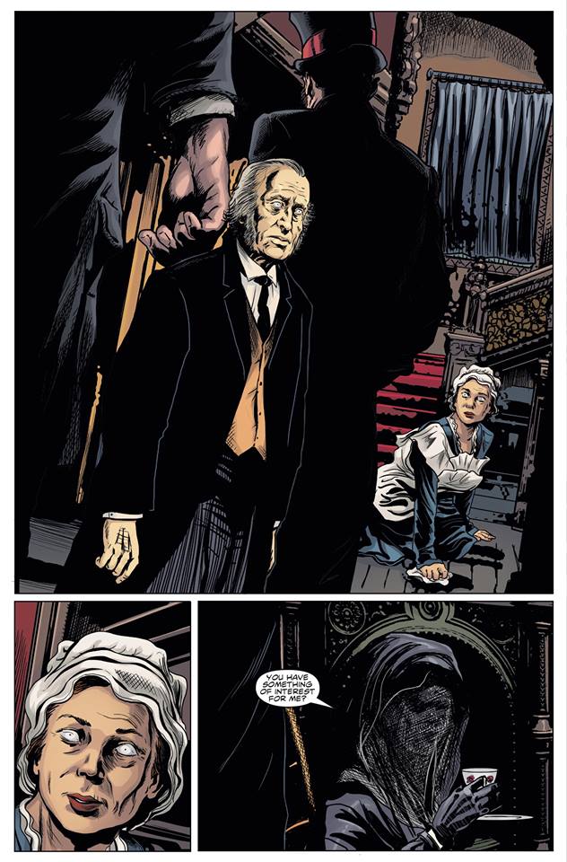
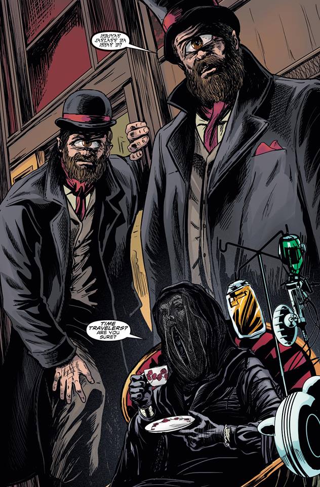
The Comic: Titan continue their line of Doctor Who comics with a brand-new four-part story, which sees the Doctor and his companion, Sarah Jane Smith on a jaunt to Victorian London. After a visit to Buffalo Bill’s Wild West Show, they’re plunged into an adventure featuring cyclopean aliens, a mysterious, veiled lady and a ‘gallery’ full of creepy statues!
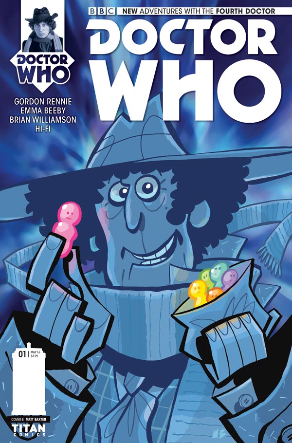
Doctor Who: The Fourth Doctor #1 – Cover E by Matt Baxter
The Review: I picked this up on a whim, having had my attention drawn to it by one of its variant covers while browsing in my local comic shop. This ‘Mad magazine’-esque cover by Matt Baxter shows the Doctor gleefully plucking a glowing, red jelly baby from a bag of its fellows while staring out at the reader.
The interior art is, however, by Brian Williamson rather than Baxter. This, to be honest, is a good thing. Despite the fact that I adore Baxter’s art, it would seem incongruous in a comic that takes its cues from the Gothic, grand guignol-stylings of the Fourth Doctor’s first few seasons. This story is far more Talons of Weng-Chiang than it is Warriors’ Gate, which is not necessarily a good or bad thing in itself; it just reflects an aesthetic choice that has been made by the comic’s creators.
Williamson’s art has a dynamic clarity that suits Gaze of the Medusa. He knows how to compose a page and how to make action flow. His figure-work, however, is still a little bit unpolished and there were times when it felt as though he had relied too heavily on photo-reference for his two leads; the result being that their facial features do, on occasion, have a fixed and stilted rather than truly expressive look. These are minor quibbles, however, and on the whole, Williamson does well. I particularly liked his treatment of the cyclopean aliens who end up in a tussle with the Doctor and Sarah Jane; statuesque figures whose height and physically imposing nature is emphasized by the compositional choices Williamson has made. In terms of conjuring up the Gothic milieu in which Gaze of the Medusa is set, the artist is ably assisted by colourist Hi-Fi, whose muted colour scheme serves the story well.
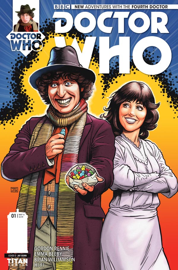
Doctor Who: The Fourth Doctor #1 – Cover D by Jay Gunn. “I wanted to homage the old Weetabix and Target books stylized colorful art style for this,” he says.
Williamson is fortunate, of course, to be working with two very talented writers in the form of Emma Beeby and Gordon Rennie. They’ve crafted a rip-roaring page-turner with lots of meaty visuals for the artist to get his creative teeth into, such as the aforementioned aliens and creepy ‘gallery’. The writers have also got the Doctor and Sarah Jane’s ‘voices’ right (an important detail in a comic whose core readership is bound, justifiably, to care about that kind of thing!)
(I should probably note at this point as I’m talking about the writing that if I’ve been a bit coy about the precise details of the story in this review, that’s because I don’t want to spoil for potential readers what is a thoroughly enjoyable romp.)
Gaze of the Medusa harks back to one of the most successful periods in Doctor Who’s history, when the show was riding high in terms of both its popularity and creative energy. It is to the credit of the team behind this new Fourth Doctor mini-series that they’ve crafted something that wouldn’t have seemed out of place as an ‘episode one’ during those halcyon days. Gaze of the Medusa, Part One is a fast-paced adventure with thrills, spills and a cracking cliffhanger that left this reader at least wanting much, much more.
• Doctor Who: The Fourth Doctor #1: Gaze of the Medusa is on sale in all good comic shops now (and some run by Zygons). Check out many of the covers here on forbiddenplanet.com
Matt Badham is a freelance writer. His work has appeared in the Judge Dredd Megazine, 2000AD and Big Issue in the North.
Categories: British Comics - Current British Publishers, Doctor Who, Features, Other Worlds, Reviews, Television
It was truly awful. When Williamson runs out of photo references his figure work and facial expressions are lousy. Here we get Tom Baker referenced from all over his era, ditto for Lis Sladen, with stock Season 13 hair plonked on them. Even worse are the Andrew Keir and Diana Rigg photo refs used for the prof and his daughter. Very clumsily done. Sarah Janes expression on the final splash page is horrendous.
As for the plot, two 10 foot tall Cyclops (badly drawn-and where did they get their outsized clothes by the way?) mooch around Victorian London, apparently unnoticed, and kidnap Sarah because she looks like a statue. Meanwhile an old lady in a wheel chair sits in a house full of pin eyed, maybe hypnotised, maybe blind servants. Weng-Chiang it ain’t!
Like a lot of Titan Doctor Who stuff it seems squarely aimed at the American market – the intro describes Tom Baker’s Doctor as a manlike mass of teeth and curls – but compared to the regular output of DC and Marvel, it’s a shallow read with poor art. Don’t bother.
Sorry, Steve, but I think we’re reading a different comic. There’e more than enough tips of the hat on the script to show that Gordon and Emma are happily paying tribute to the source material of the early Tom Baker stories and I don’t see why artist Brian Williamson shouldn’t have some fun, either. The plot’s fun and there’s a smashing twist at the end (no spoilers!). As for the sequence where Sarah’s captured, it’s clear this sequence happens quickly – ironically, the passage of time is hard to get across in a comic! – and her abduction would have been all over in under a minute if this was a TV story. For me, Brian’s work is great and the story’s a nice introduction to a tale that features many of the elements of the very best of Doctor Who on screen.
As for likenesses – well, artists commissioned to work on licensed books can’t win, whatever they do, with some readers. Ever. You either go the photo realistic route, like Richard Piers Rayner, John Ridgway, Brian Williamson and many other fine talents on Doctor Who comics down the years, and be castigated for using photo reference – even though they have captured the actors’ likeness. Or, I’d argue, you go the route that Lee Sullivan, Martin Geraghty, Emma Vieceli and, to a lesser extent, Mike Collins do, which is to offer an interpretation of the Doctor they’re portraying, which some readers will decide doesn’t look like the actor and dismiss the strip’s “validity” because of it.
Neither route is “wrong”, it’s just a different way of delivering on the commission. I was more than happy to commission from both camps when I edited Doctor Who Magazine, because these artists are great at what they do and deliver the goods. I’d happily commission them in a heartbeat if I was an editor working on such a range.
I don’t think it’s possible for artists working on this kind of book to please all of the people all of the time, because the audience often has very fixed of ideas of what “their” Doctor looks like – but they do a darn good job, in my opinion.
I couldn’t have said it better myself John. Comics fans normally have a preference when it comes to these type of comics – use photo reference and get the portrayals correct or create an artistic expression of the character. And whichever version is drawn is going to be loved by one group of fans and shunned by the other. I like both versions of comic for numerous reasons. Hopefully others can as well.
No, John, we’re reading the same comic. I don’t have an issue with artists using photo reference, especially on titles using characters from TV and film, although I prefer them to develop their own interpretation of the character. I just think it should be used much better than Brian Williamson does here. When it’s not done well the artist is then forced to make the composition of the panel fit the reference photo rather than tell the story, leading to awkward poses, lots of examples here but the Doctor grabbing the professor’s arm towards the end stands out. For the record my favourite Doctor Who comic strips were those by Dave Gibbons, Mike McMahon and Alfredo Buyulla.
As for the smashing twist in the plot, it’s not so smashing if you remember the Sarah Jane Adventures Eye of the Gorgon plot or the Doctor Who Stone Rose novel by Jac Rayner. Tips of the hat are one thing but here was an opportunity to develop Who in a fresh medium squandered by rehashing tropes from old episodes and stilted by stiff artwork.
Jeremy, do you like everything? Should everyone? I’m open minded enough to enjoy a variety of interpretations I was just expressing my disappointment with what could have been something special. There is a lot of Doctor Who produced at the moment, for me this comic didn’t work. Just because I’m a fan I don’t have to slavishly like everything that is produced.