 Hello!
Two of the three comics I’ve reviewed this month are from the Bristol Comic Con 2014 – where did that one go? Our creative city’s lone convention this year is now the Bristol Comic and Zine Fair in October. There’ll be a lot of comics and a lot of love and a fair amount of cider I shouldn’t wonder. Huzzah!
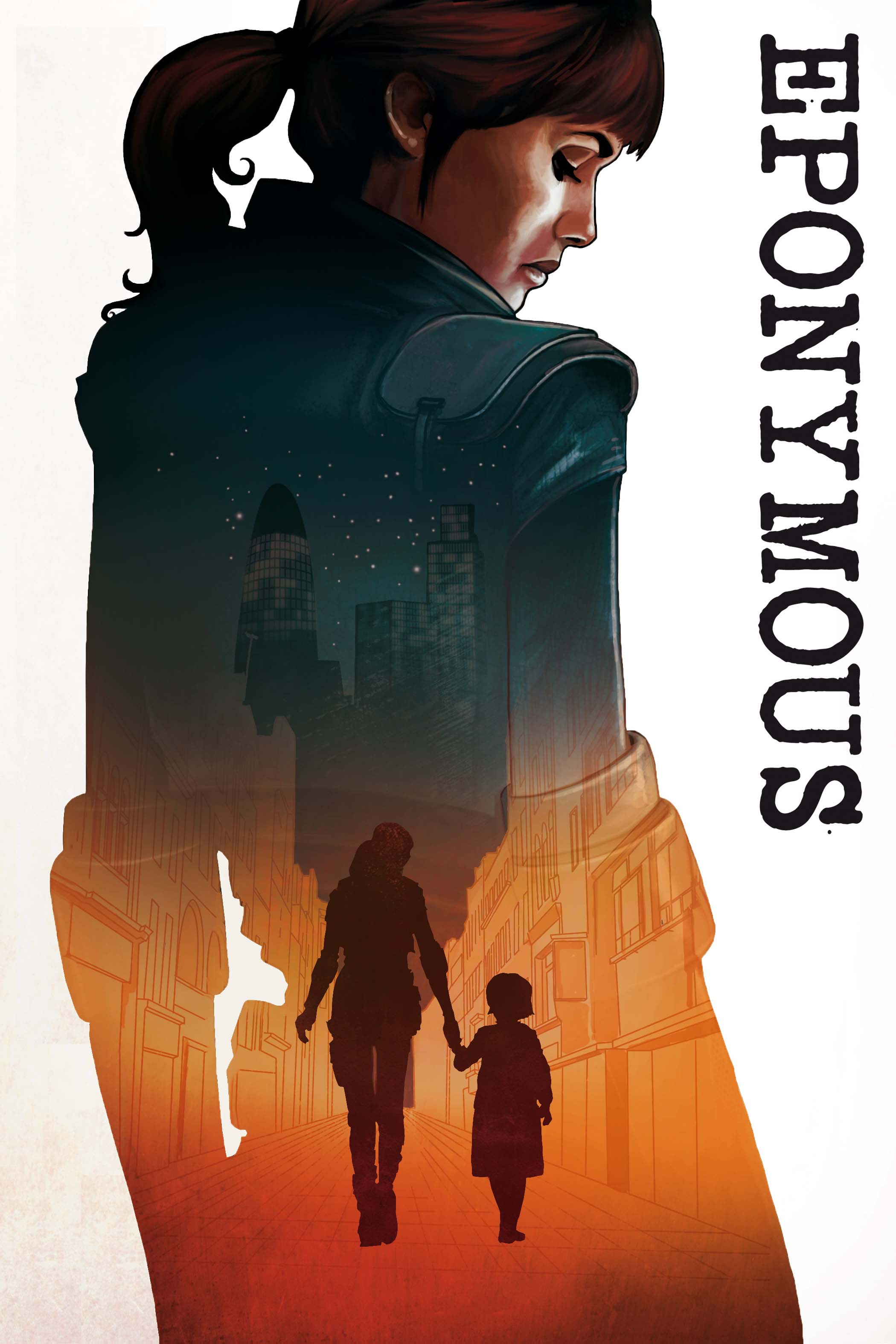
Eponymous 1
Mike Garley/Martin Simmonds
Eponymous is a collection of short in-universe stories culled from the digital VS Comics anthology. As such it is canonical but moderately scatter-shot – perhaps an intro or a glossary or something that roughly outlined this new superhero-infused reality would have bound these stories together a bit more – as it is they feel a bit isolated (not helped by the jarring “see last story” text boxes dotted about) . It is an intriguing world however and Mike Garley’s rock-solid pacing and atmospherics are all firmly in place and make it a compelling read.
Martin Simmonds’ art is a genuine marvel – squashed into loveable A5 it is absurdly dense and tremendously attractive. The colours are muted – and there’s a nice painted quality to the whole thing. It was slightly reminiscent of the work of 2000 AD’s Lee Carter. Simmonds is a bonafide comics talent.
Whenever anything is lettered by Mike Stock it’s always worth mentioning – he’s one of the classiest designers in the small press and his lettering is bloody good. The integrated SFX (I do love integrated SFX) are flawless and a joy to behold.
This tidy little tome is a rock-solid bit of small pressery – stylish and supremely confident. More of this sort of thing.
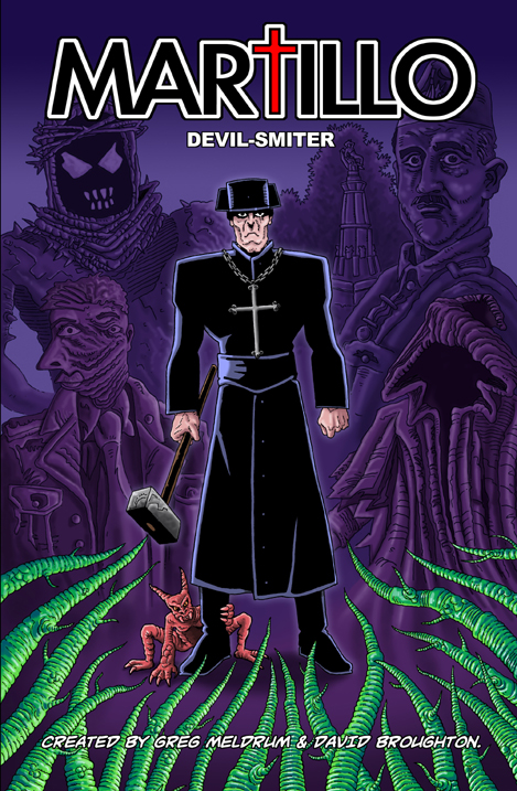 Martillo – Devil-Smiter
Greg Meldrum/David Broughton
Years ago I used to self-publish a Doctor Who themed anthology comic called Dr WTF?! which featured bizarre alternate doctors in self-contained stories. By the far the most profoundly brilliant and strange scripts we got came from Greg Meldrum. I’m not sure where he’s from. Space I think. Another dimension possibly. I leapt at the chance to buy this series of tales that pertain to 1940s hammer-wielding Spanish exorcist because… well because it’s Meldrum in spades. Insane cultural & historical mash-ups – and ludicrously ambitious set pieces that’d be a massive headache to draw if they weren’t so damned fun. It’s laid out as a series of separate stories but all of them have a solid overriding narrative that holds together very well. I certainly remember the first story appearing in the digital anthology Temple APA back in 2012 – but it essentially works as a coherent single story.
The art is by small press legend David Broughton – an artist of exceptional constancy who can turn even the most delightfully insane Meldrum-plot into something solidly readable. His art within is a fine black and white – alive with lines and quite reminiscent of some of early 2000 AD’s more lucid action stories. Instantly absorbing. His cover in colour as well is a nice greeny/purple affair that’s quite eye-catching. We see a tantalising glimpse of Martillo by Dredd artist Ben Willsher on the inside front & back cover as well. Everything is lettered tremendously ably by the artist – you wonder if there’s anything comics-wise that Broughton can’t do…
So – Martillo is really a highlight of the small press output of the last year in the UK for me. Two creative goliaths having a whale of a time and producing a solid and tremendously fun book. Do seek it out – alone they are formidable talents but together they’re utterly superlative.
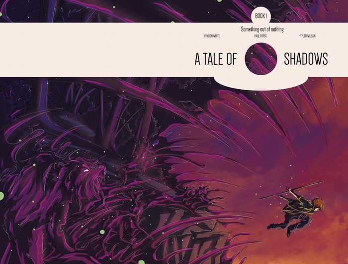
A Tale of Shadows Book 1 – Something Out of Nothing
Lyndon White, Paul Clark-Forse & Tyler Wilson
A Tale of Shadows is a recent Kickstarter breakthrough we featured on downthetubes back in March that did terribly well and that I was asked to review by the creators. The first book is a slim 28 page introduction to a bit of a rough sketch of a fantasy world ruled by an oppressive religious order. It’s an interesting premise but in Book 1 we are given very little – which is unfortunately a bit of a recurring event in single-narrative self-published comics, an interesting but brief ‘Book 1’ all full of passion and promise that rarely gets a conclusion at all. I’ve been spoiled perhaps by recent rich all-in-oners like Porcelain (Improper Books), Pirates of the Lost World (Markosia) & Thaddeus Mist (AccentUK) which tell effective self-contained stories and have more-or-less definitive ‘endings’. Although I’m more than aware that those kind of small GNs are far more challenging to put together. The tone of Something Out of Nothing is a bit inconsistent also – featuring a playful colloquial fourth-wall breaking ‘commentary’ over most of it which may be a sign that the creators having a lot of fun but is quite irritating. Our protagonist is a cocky young lad and we’re seeing this world through his shallow and flippant viewpoint – which makes it hard to particularly care about any of it. Any confrontation has the looming threat of there being a little arrow pointing to the enemy saying “gnarly dude” or something. Which sucks a lot of the energy out of it.
The art of Book 1 is similarly inconsistent – it’s hard to work out what exactly both of the credited illustrators (Lyndon White and Tyler Wilson) are responsible for particularly but the introduction alone is lovely – beautiful muted colours, strong design and a palpable kinetic energy. After that though it feels very different – the colouring remains attractive and very strong but the illustrator(s) decision to frame almost all the line work with a secondary “white” line makes everything look loose and sketchy – and generally the figure work and the faces particularly are awkward and extremely variable. The lettering throughout is similarly problematic – the informal commentary is done in an loose sketchy white line (to match that around the figures perhaps) and is either intrusive or near-invisible depending on the artwork beneath. The dialogue is done in a strange angular font where the ‘C’s are sideways triangles and the lower case ‘i’s have distractingly large dots – admittedly it’s a refreshing change from the same five Blambot fonts you normally see but good lettering shouldn’t be noticed and this catches the eye a bit too often.
A Tale of Shadows is not without charm (we have some preview pages here) – the whole thing has a strong design and a breathless enthusiasm that doubtlessly contributed to its considerable success on Kickstarter. I deeply hope that there’s a second book and that they reign in some of their wild stylistic excesses and push the story a bit more – because beneath the inconsistencies there’s clearly the potential for something quite special.
Related Links
• Eponymous: mikegarley.bigcartel.com/products
• Martillo: comicsy.co.uk/martillo/store/products/martillo/
• A Tale of Shadows: kickstarter.com/projects/612195279/a-tale-of-shadows-book-1-something-out-of-nothing
- About the Author
- Latest Posts
Owen Watts is a small press editor, artist and colourist. He currently co-edits The Psychedelic Journal of Time Travel – a twice-yearly small press anthology featuring over 15 different emerging creators every issue. He has recently helped colour Ben Dickson & Gavin Mitchell’s Santa Claus vs. The Nazis for Aces Weekly which is due out as a single volume with Borderline Press later in 2014. He also runs the 2000 AD forum art competition, reviews small press comics and becomes a hippo every second Thursday.
 Looking Back at Enniskillen Comic Fest 2026
  In Review and in Pictures: Stoke Commando and British Weekly Comic Swap Meet
  In Review: Obsession
 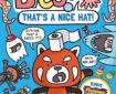 In Review: Squid Bits: That’s a Nice Hat By Jess Bradley