
I’ve got my grumpy head on this morning. Bear with me while I grumble.
Back in the 1990s, many young artists would show up at the few British comic conventions there were back then and present their portfolios to Marvel UK’s editors, or send work in on spec, just as they do today, but to far fewer publishers than there were back then. One of those young hopefuls who crossed my path, albeit briefly, was Darren Taylor, whose client list in 2015 as a character designer and illustrator is impressive, including Hasbro, CBeebies, Visit Scotland and many others.
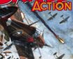
Earlier this week, he very kindly dropped me a line after coming across some Marvel UK pencilling guidelines I’d given him back during my time working for the company, along with a sample Action Force script offered as a tryout. (I’m not sure why it was an Action Force strip, since I never worked on that comic, although it might well have been in the run up to the company’s launch of its “Genesis 1992” range, when then editor-in-chief Paul Neary was actively looking at the work of many young artists for the new titles he was planning, and a Doctor Who script – the main title I worked on – wouldn’t have been an appropriate test).
Anyway, I thought some of you out there might be interested in seeing them here. (I’ve got several of these guides somewhere in the house, including a fabulous lettering guide by David Lloyd. Let me know if you want to see more).
Reading these notes now, they look like a distillation of much of the advice drummed into me and others by several editors as part of many inhouse Tutorials, including Richard Starkings (creator of Elephantmen, owner of Comiccraft and a huge influence on my early days as a comic creator), Steve White (now at Titan Comics), Tom DeFalco (then Marvel US Editor-in-Chief, one of the longest serving individuals to hold that post) and, possibly, the late Mark Gruenwald, a writer and editor who, among other credits, wrote more issues of Captain America than any other writer in the Marvel Universe.
Please bear in mind that these guidelines were for titles aimed at younger readers and any mention of a specific artist was certainly not a criticism of those artists’ work.
- Stick To Kirby Layouts. The sort of page layouts favoured by Frank Bellamy on Thunderbirds and Steve Bissette on Swamp Thing (affectionately known as ‘Broken Glass’ layouts) only complicate the story-telling process and thus make the reader’s ‘job’ a lot harder. It is also advisable to avoid the ‘Buscema’ layout as this often calls for the addition of arrows to clearly show the progress of action.
- Avoid Overlapping Panels At ALL Times.
Again, this sort of gimmick tends to complicate the flow of the narrative from frame to frame. If the eye of the reader is drawn from Panel 1 to Panel 3 because the head of a character in the latter panel intrudes on the former (or the leg of a character in the first panel stick down into the third) then the artist is unnecessarily confusing the progress of the story. - Avoid Insetting Panels Over or In Other Panels.
Inset panels often look nice but can and do distract from the detail of the panel that the first is set in. - Do NOT Bleed Artwork Outside The Dimensions of the Standard Page Area.
Bleeding can be as painful to a page as it can be to you – don’t do it! - Always Ensure That There is PLENTY of Room for Captions and Dialogue.
The placement of Balloons and captions is the responsibility of the penciller NOT the letterer – if the penciller makes an allowance for dialogue when he/she draws the artwork then there will be no unnecessary script alterations before the strip is lettered. As a general rule, bear in mind that balloons float UP. Take a look at any example of John Byrne’s work and you will find that only rarely are captions and dialogue positioned at the bottom of a panel. Again, as a general rule, leave the top third of panels free of important action or detail. - The Drawing of Sound Effects Should Be Left to the Letterer.
- Characters Should be Sharply Defined and Clearly Outlined.
We’re producing colour comics here and you should always strive to make the colourists job as simple as possible. If a character is featured in a close up, it is probably best to drop out the background altogether. - Draw What is Asked For in the Script.
Cut corners only when you feel that doing so will help the flow of the story. - Pages Should Feature the Following Information (in INK) in the Top, Right-Hand Corner of the Page.
Title of the Comic/Issue Number/Page Number.
Some of the online reaction to seeing these notes, which Darren posted as he thought they’d be of interest to artists today looking to break into comics, seemed rather odd. One commentator even went so far as to describe them as “arrogant”. To be honest, for me, this simply reflects how few commercial companies are out there in the British industry producing comics because I look at this guide now and still think it’s all relevant if you want to create comics for any age group. And working to such ‘rules’ worked for Marvel UK, which in its heyday, had titles such as The Real Ghostbusters selling some 100,000 copies a week.

The Real Ghostbusters, its format the brainchild of Richard Starkings, was a hugely successful title for Marvel UK, as was Transformers.
Of course, all ‘rules’ are there to be broken – but for me, a lot of independently-published work these days suffers from the awful lack of avenues for creators to work in commercials comics publishing in the UK. If there were more avenues then, I’d argue the guidance above would be issued to every editor, and if you think these are strict, then you wouldn’t have got in the door at DC Thomson back then, or, in all probability, Fleetway.
So yes, such guidance may well seem arrogant to some, but they helped make Marvel UK hugely successful in the British marketplace. I don’t think it’s arrogant to expect the best of the creators you are paying to do work for you.
- About the Author
- Latest Posts
John is the founder of downthetubes, launched in 1998. He is a comics and magazine editor, writer, and Press Officer for the Lakes International Comic Art Festival. He also runs Crucible Comic Press.
Working in British comics publishing since the 1980s, his credits include editor of titles such as Doctor Who Magazine and Overkill for Marvel UK, Babylon 5 Magazine, Star Trek Magazine, and its successor, Star Trek Explorer, and more. He also edited the comics anthology STRIP Magazine and edited several audio comics for ROK Comics; and has edited several comic collections and graphic novels, including volumes of “Charley’s War” and “Dan Dare”, and Hancock: The Lad Himself, by Stephen Walsh and Keith Page.
He’s the writer of comics such as Pilgrim: Secrets and Lies for B7 Comics; “Crucible”, a creator-owned project with 2000AD artist Smuzz; and “Death Duty” and “Skow Dogs”, with Dave Hailwood.
Categories: British Comics, Creating Comics, Featured News, Features
 Rebellion announces new Battle Action mini series – our guide to the returning strips
 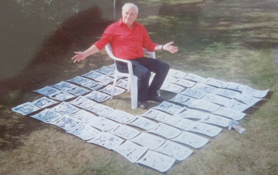 Comic Creator Spotlight: The Art of Gordon C. Livingstone
  The Rotten State of Newsagents – Is it any Wonder Publishers Are Pushing Digital?
I was given a copy of these guidelines, must have been over 25 years ago now and I still follow them to this day when laying out pages. Nothing arrogant about them, just common sense really!
Cheers Paul! I totally agree of course!
I’m sure we had similar though not quite as prescriptive instructions for Commando back in the day. We did used to have a sample script to send out to possible artists. It was always the same one to keep the playing field level. I must rake through to see if I can find them and let you have them.
Strangely, I think the guidelines to writers were more detailed that those to artists.
These guidelines all seem eminently sensible (especially for the kind of comics they are aimed at). I’m a firm believer that young artists should try to master the basic rules before they try to break them, & that applies to layouts just as much as it does anatomy & perspective etc.I started with Marvel UK back in ’88 on various of those ‘younger readers’ titles (Action Force, Transformers, William Tell, Manta Force among others), when I probably could have used exactly these kind of artwork guidelines, but unfortunately I never received anything along these lines. I do remember Steve White giving me two bits of advice early on though, 1) always make sure to leave enough space for dialogue & 2) always show a character in full figure when he/she first appears in a story.
Assembled my own humble version of all the guidelines I received back in the late 8os plus some of my own thoughts here: http://www.leesullivanart.co.uk/www.leesullivan.co.uk/Writing_and_drawing_for_comics_%28article%29.html but can you tell young people today? 🙂
I was just about to add that page as a link above! Thanks Lee. Whenever I search for ‘Buscema Layout’ on Google, this page crops up pretty quickly.
I never saw these guidelines when I tried to get work with Marvel UK. I wish I had as I’ve had to learn them by mistakes which is the hard way.:)
Holy Crap JF! No wonder you struggle with my art sometimes – reckon I’ve broken just about every one of those rules – on the same page!!!! I promise to pay more attention with the art on “Rourke” and “Warworldz” in future but knowing me as I do I’ll probably still keep on sub-editing the scripts to make the art look prettier!!! Bwaaaaahahahahaha!! Who says you have to be mad to draw comics?! Er…me probably!
There’s been an assumption from some quarters that these ‘rules’ are cast in stone. They’re not, necessarily – every rule is made to be broken and if you’re creating your own comics and have your own story to tell, and you’re not worried about commercial gain (as Marvel UK would be), then by all means, go ahead and break every single damn one of them. I love rule breakers and artists we all know and love have broken the ‘rules’ many times and they’re probably the ones we remember most. Let’s not remember them, though, because you didn’t understand the story they were telling – and in the case of Frank Bellamy, Will Eisner, Alfred Bestall, Albert Uderzo, and many, many others, i think you’ll find they are remembered for their great art and storytelling because no matter the layout, the story flowed in a logical way that even the youngest of readers could follow. Some critics of these ‘rules’ don’t seem to appreciate this.